Свобода
Создание бренда культовой рюмочной
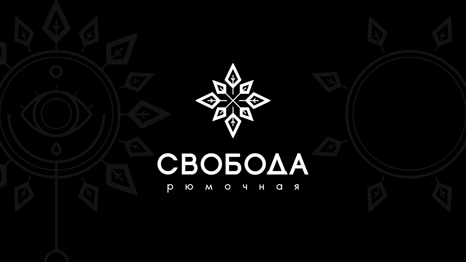
Свобода у каждого своя
Именно с таких слов началась наша беседа с Кириллом Туревским, основателем рюмочной «Свобода». В тот вечер мы обсудили многие темы и смыслы. В какой-то момент обсуждения Марина перешла к наброскам на бумаге. Так родился символ, который лёг в основу логотипа и послужил направлением для дальнейшей разработки.
Откуда дует ветер?
Свобода, в первую очередь, — возможность выбора пути, направления роста и развития. Эта идея объединяет буквально все элементы в айдентике рюмочной. Марина использовала два основных элемента в начертании логотипа: розу ветров и растительные листья.
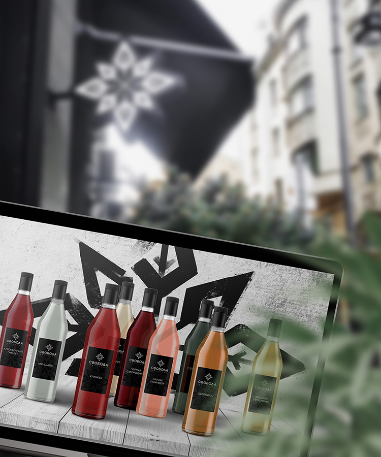
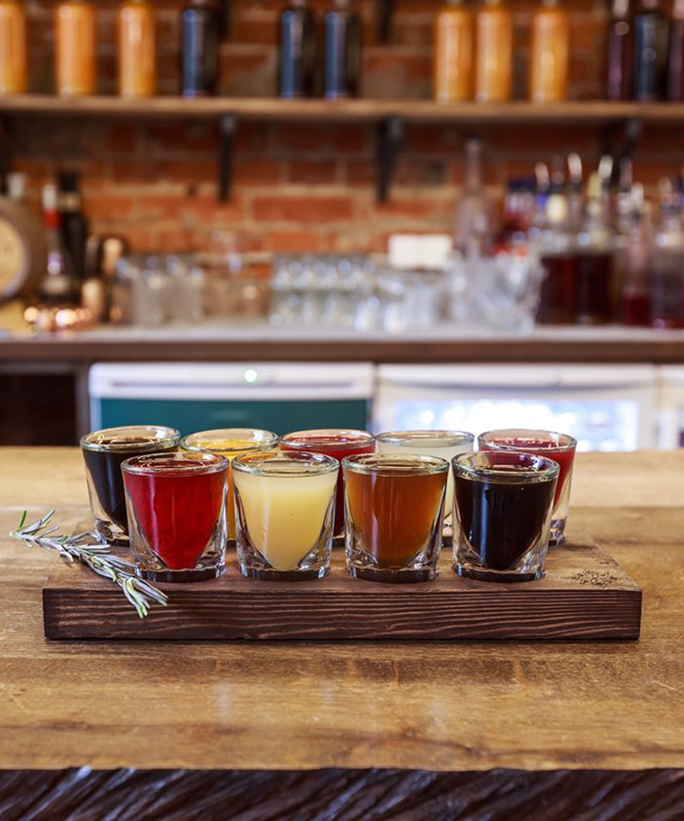
Форма розы в геральдике наиболее точно передаёт направление. Настойки исторически делались из трав и плодов. Листы в контексте рюмочной — прямая отсылка к авторским настойкам, которые производит в этом заведении наш талантливый друг, бартендер Дмитрий Семёнов.
Смотрим в корень
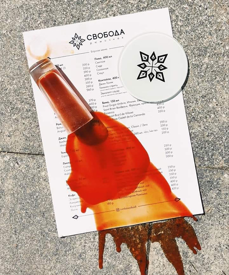
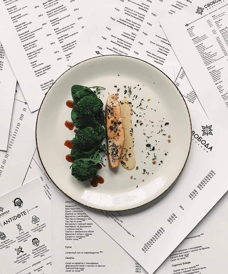
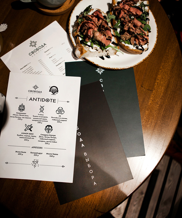
В рамках проекта по первичной упаковке бренда нами были разработаны: меню, серия наклеек на разные носители, костеры, шаблоны для ведения сообществ в интернете, дизайн карт для постоянных гостей.
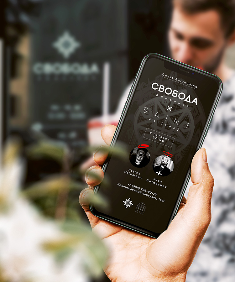
На поздних этапах разрабатывали сезонные афиши. Андрей разверстал двуязычное меню и барную карту. Даша создала шаблоны оформления товаров для интернет-каталога с настойками.
Что дальше?
Полина, Глеб и Андрей спрототипировали и изготовили деревянные подносы под сет фирменных настоек, проконтролировали производство полиграфии и провели комплекс работ по фасаду.
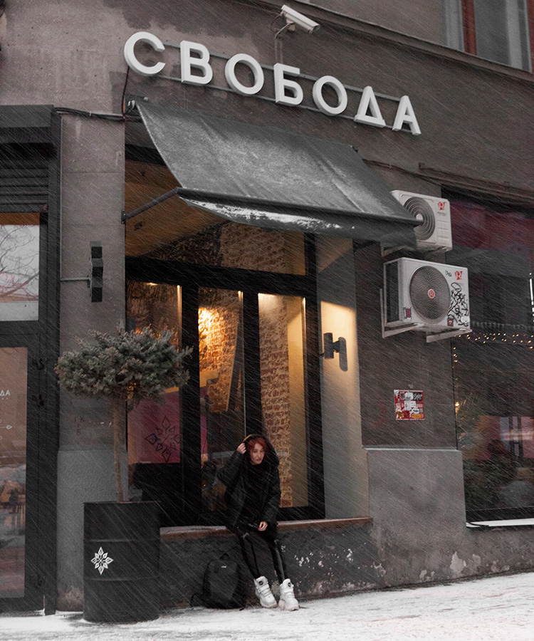
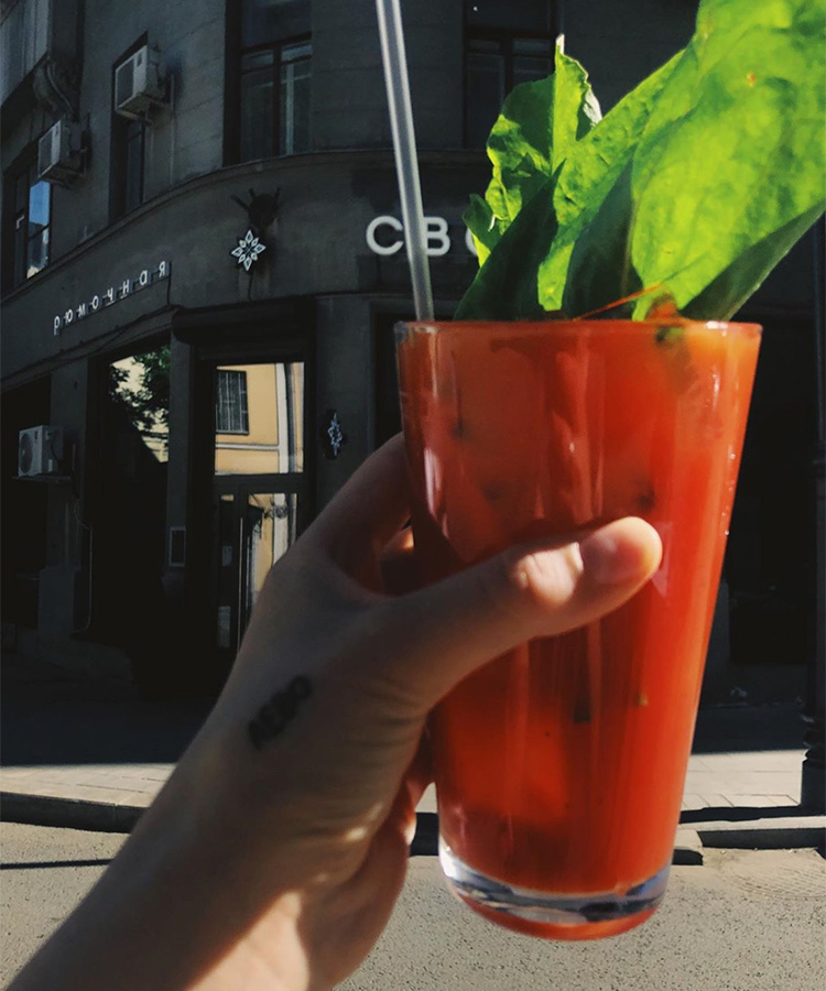
Всех желающих опробовать блюда и кастомные настойки приглашаем по адресу: Кривоколенный переулок, д. 14, c1. Будем!
Вернёмся в прошлое
— Марина, какие впечатления от проекта?
— Можно я посплю?
— Это было утомительно?
— Жизнь утомительна!
— А если по сути?
— Впечатления положительные: быстрый процесс согласования, продуктивная работа, когда ты на одной волне с человеком и личные вкусовые предпочтения совпадают. Получилось чисто и со смыслом, как я люблю.